Colour accuracy during scanning
As we beginning to upload new works, We seem to be having a bit of trouble getting colours to display correctly. We want to represent the artworks onscreen accurately so that they are as close to real life as possible. We don’t want anyone to be disappointed after purchasing a van den hooven. So we’ve tried to get the colour reproduction as accurate as possible, but it has not been easy.
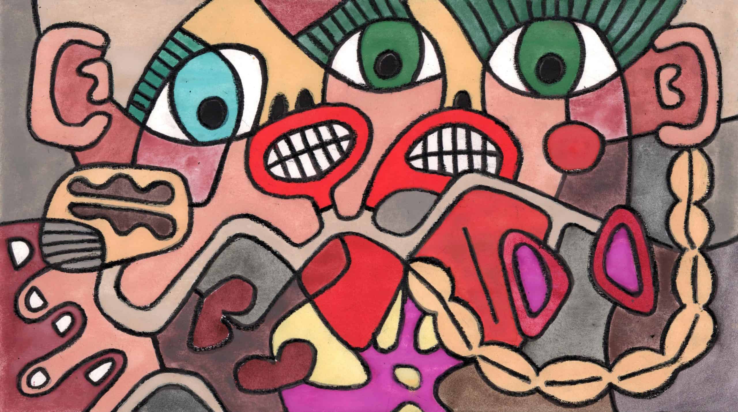
For example, if we set the white balance correctly for the overall image, it appears that some colours are still slightly off. Noticeably off. Namely, vermillion shows up significantly redder than it should (almost completely losing it’s orange tone/hue). We’re not sure if this is due to our particular brand of scanner or whether some colours/pigments simply don’t like being scanned (exhibiting some sort of different colour shift response).
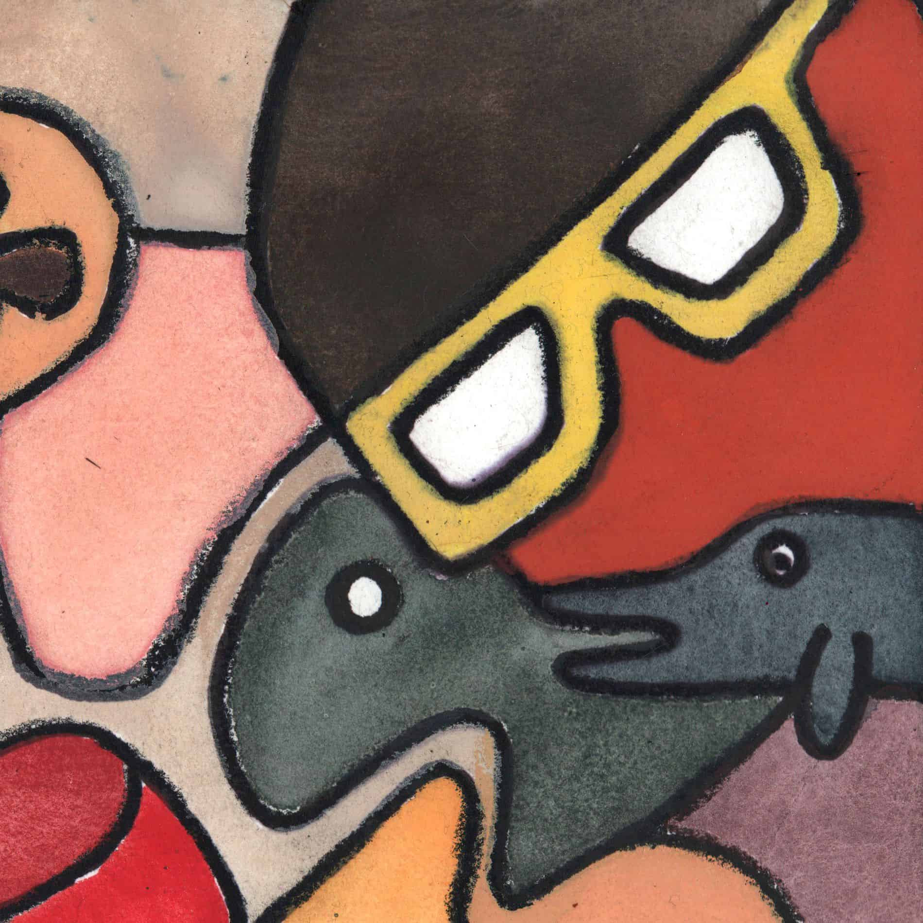
When we were “fixing up” the vermillion face in the scene presented here, we realised that the Praseodymium yellow spectacles also appeared slightly off. They were more orange than expected (much too warm). Has anyone else experienced this?
In the end we actually had to use photoshop’s quick selection tool and shift the colours manually just in that one section. Otherwise, the face appeared almost the same colour as the cadmium red heart (and believe us, it’s not).


